
Conversation Topic
Carpet Colours & Interior Styling Page 4
Explore BCC questions, visual examples and practical guidance about carpet colours & interior styling.
Real customer questions, cleaned answers and visual examples around Carpet Colours & Interior Styling.
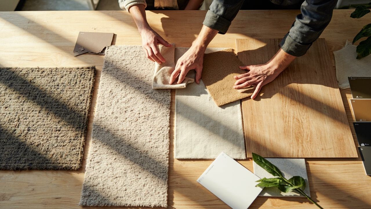
You Asked — We Answered
Answers About Carpet Colours & Interior Styling
Historical BCC customer questions are preserved in their original wording where they provide useful public intent; stale answer material has been cleaned for the current Digital Twin.
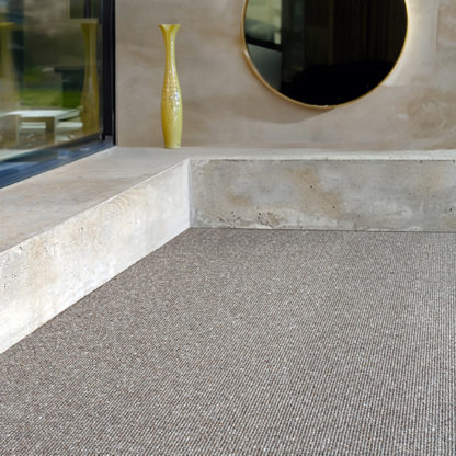
Choosing a carpet colour depends on room light, furniture, desired mood and lifestyle. Neutrals such as beige, grey and cream are versatile and work across many schemes; warm tones add cosiness, while cool blues and greens create a calm atmosphere. Darker colours can hide stains and define a space but may make smaller rooms feel smaller; lighter tones brighten rooms but may show wear more readily. Consider future décor changes and maintenance needs when de…
What carpet goes with satin finish timber flooring?What pairs well with satin‑finish timber depends on the room’s light and the desired mood. Neutral and soft tones — warm beiges, creams, soft greys or muted earthy colours — complement timber without competing. Texture is equally important: low‑profile loop or short‑pile plush carpets create a neat transition from timber, while textured weaves add depth in larger spaces. Trade‑offs include light colours showing more soiling and darker tones masking wear bu…
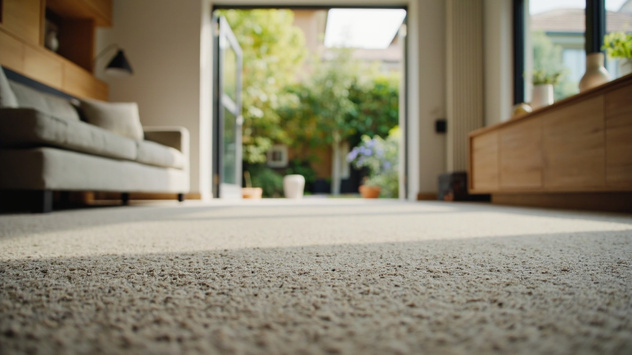
What’s coordinating carpet colours go with Dulux natural white painted walls?Dulux Natural White works well as a versatile backdrop for many carpet colours. Practical combinations include: neutral tones such as beige, soft greys and taupe for a calm, adaptable scheme; earthy hues like warm browns or muted greens for a cosy, grounded feel; and soft pastels such as pale blues or dusty pinks for gentle contrast. Patterned or textured carpets (for example loop pile or Berber) can add interest while keeping the palette cohesive. Availab…
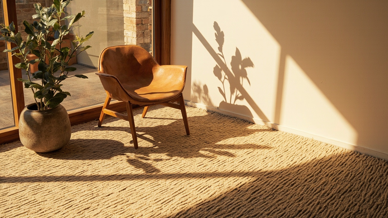 16 Q&A
Eco-Friendly, Allergy & Health Considerations
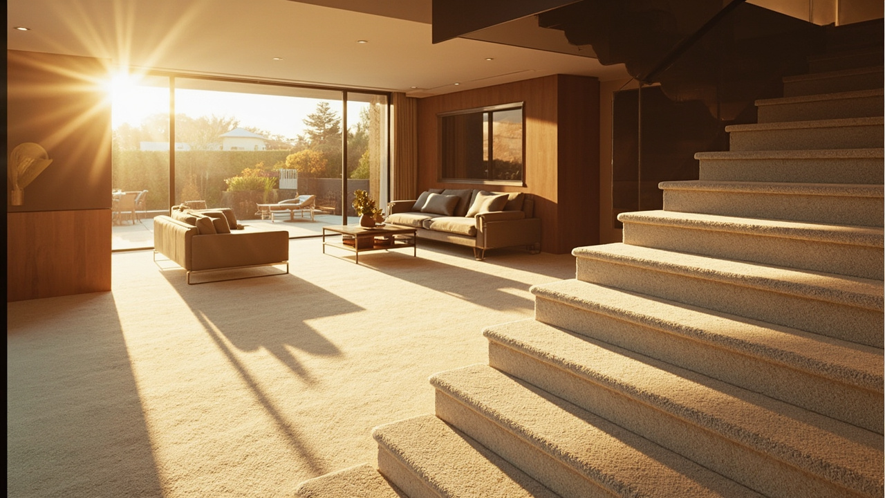 17 Q&A
Customer Reviews, Projects & Business History
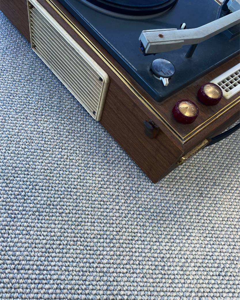 102 Q&A
Wool Carpets & Natural Fibres
 48 Q&A
Carpet Trends, Style & Inspiration
 30 Q&A
Woven Wool, Axminster & Wilton Carpets
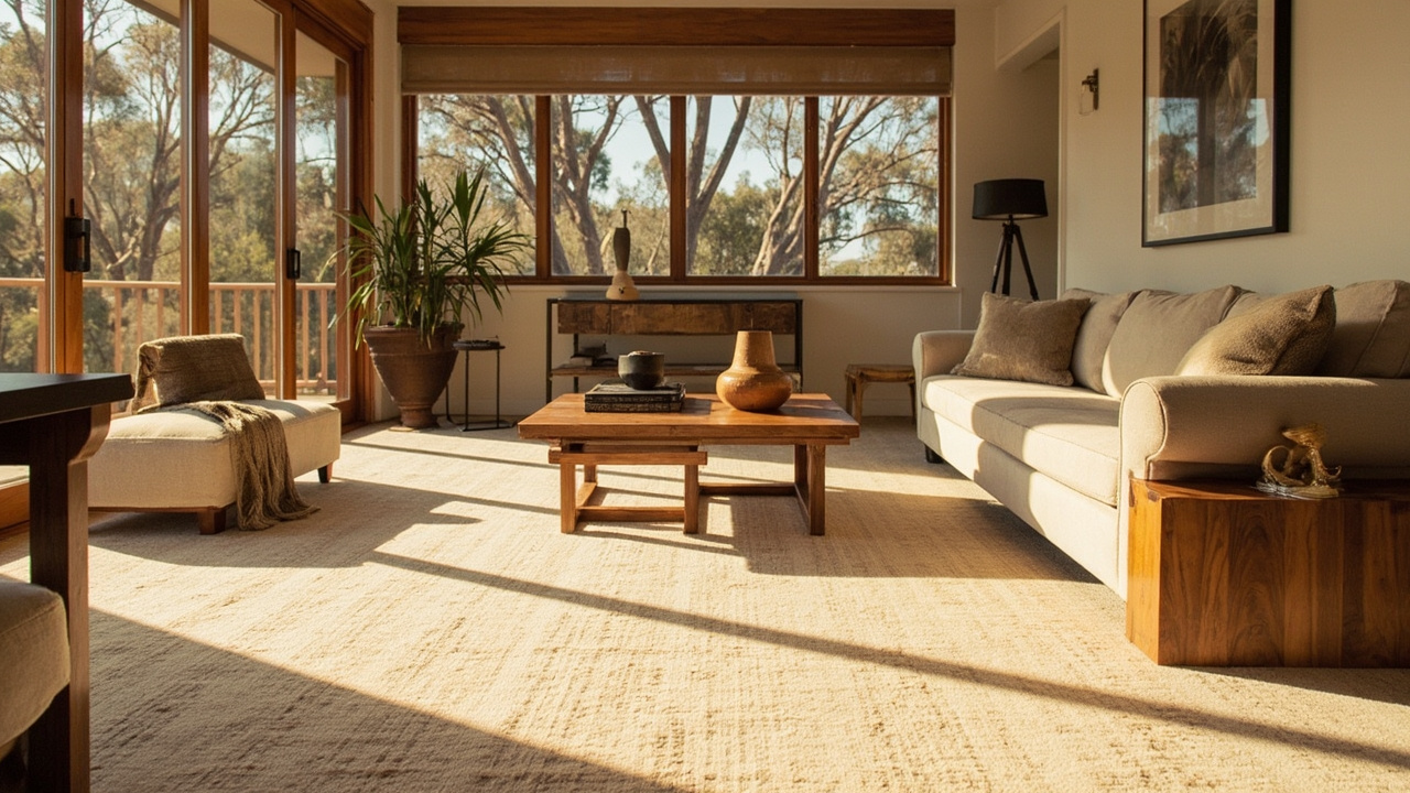
Natural light changes how carpet colours look. Direct sunlight can intensify vibrancy, while soft, diffused light may mute tones. Time of day matters: morning light often enhances cooler shades, afternoon light can enrich warmer colours. The room’s orientation also matters: north-facing rooms feel softer light that can make warm tones stand out; south-facing spaces are brighter and can shift colour perception. Surrounding walls and furnishings reflect and …
What’s the best colour and texture carpet to match my oak timber?To complement oak timber flooring, consider: Colour ideas — warm neutrals (beiges, light browns or taupe), warm greys, creams or ivory for contrast, and earthy tones like olive or muted terracotta. Texture options — woven for depth, plush for softness, or loop for durability. Wider widths can reduce joins in large rooms when a suitable product is chosen. For tailored styling options and availability, please call the Taren Point showroom on 02 9526 6421.
What’s the best colour carpet to go with my new paint colour antique white?Antique White is a versatile base that pairs well with a range of carpet colours. For a timeless look, try warm neutrals such as beige or cream, or taupe. If you prefer a contemporary feel, lighter or mid greys sit nicely with antique white without competing with it. For a softer, more pastel effect, pale blue or sage can work well, while a chocolate brown offers a rich, cosy contrast. When choosing, consider the atmosphere you want: lighter colours feel a…
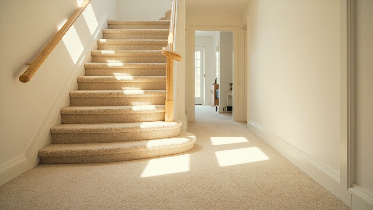
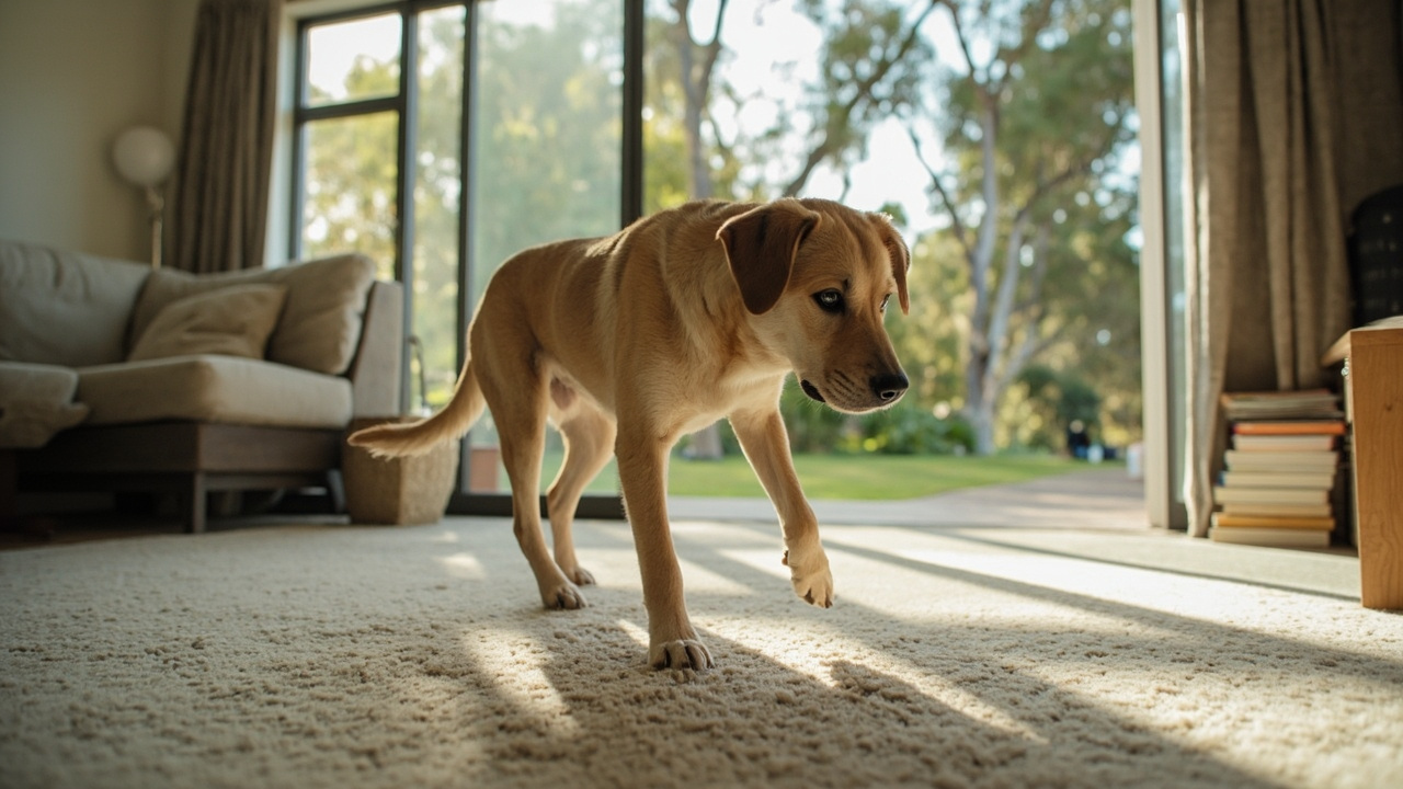
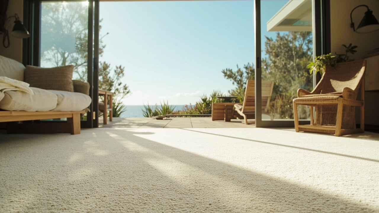
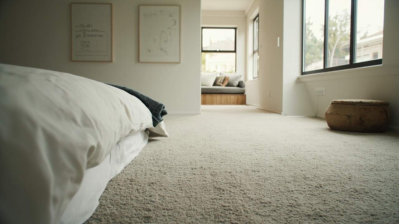
Visual Examples
Images That Support Carpet Colours & Interior Styling
A broader mix of real BCC carpet photography and topic visuals connected to this subject.
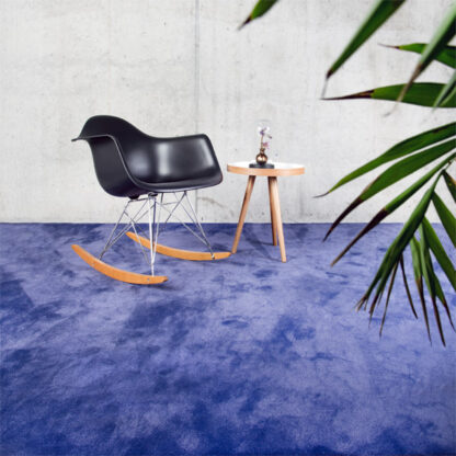 interior
Blue plush carpet with modern chair
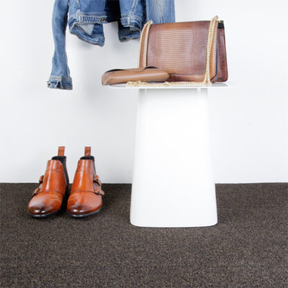 sample
Brown textured carpet flooring sample
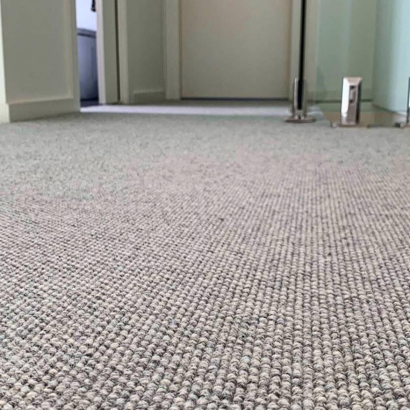 hallway
Grey carpet floor in hallway
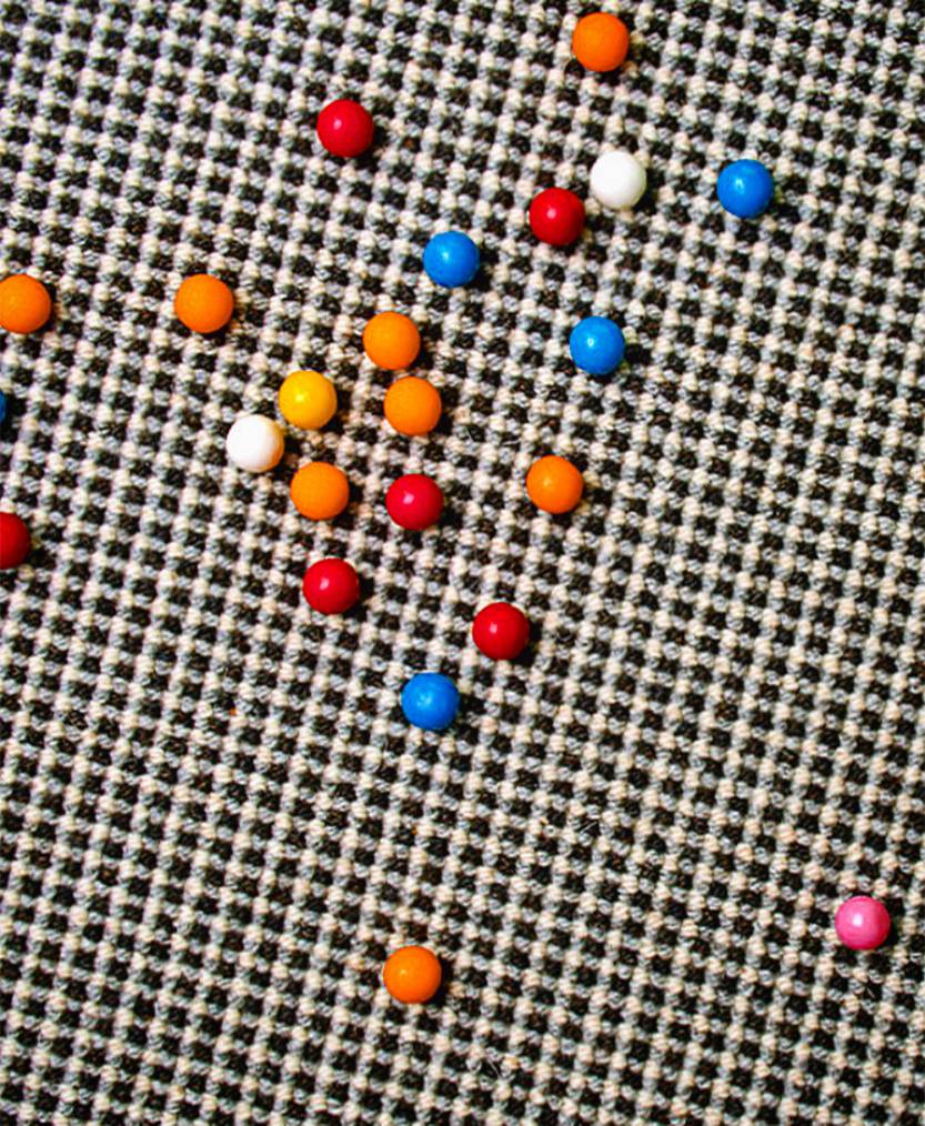 patterned carpet detail
Colourful patterned carpet detail
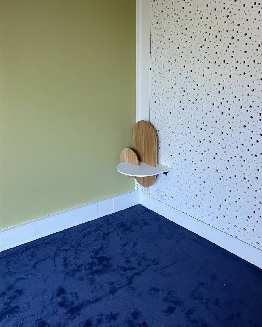 styled blue interior
Blue carpet in a styled green-wall interior
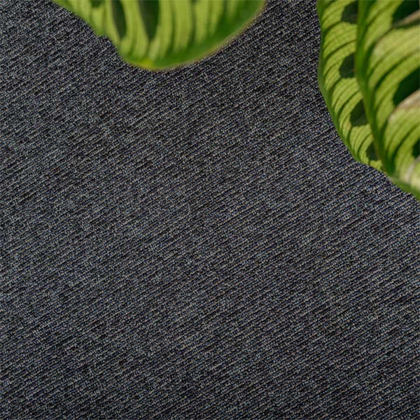 textured carpet detail
Dark textured carpet with natural green leaves
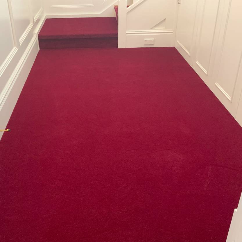 red hallway and stairs
Deep red carpet installed through hallway and stairs
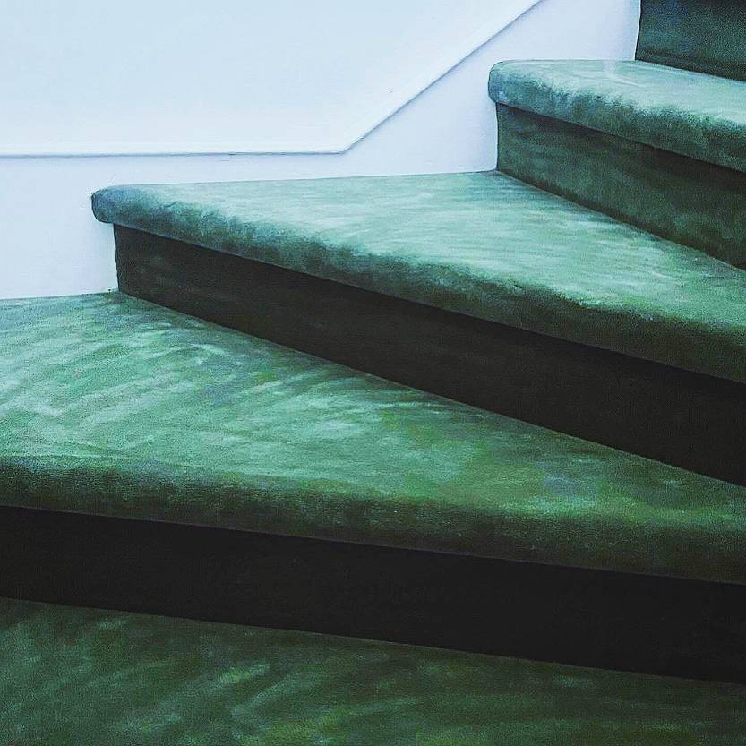 green carpeted staircase
Green carpeted interior staircase
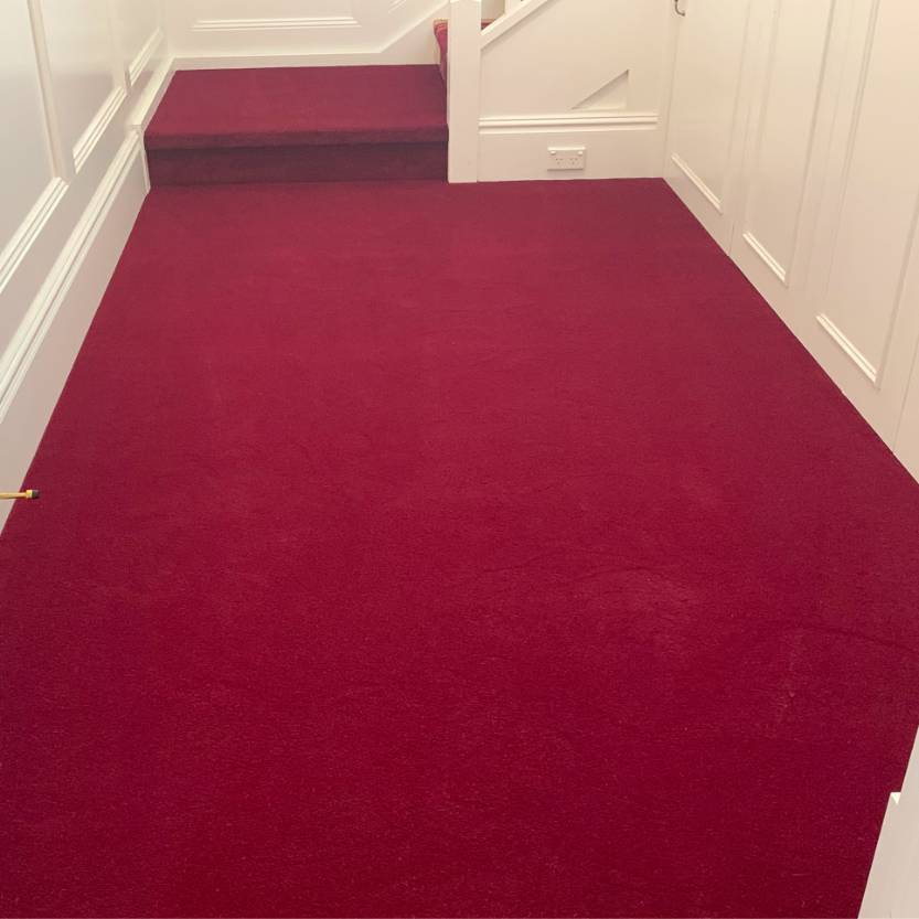 red carpet interior
Clean red carpet flooring in an interior
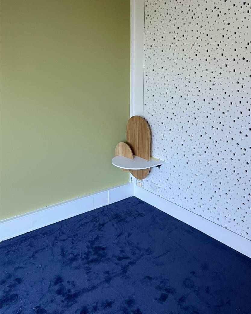 navy blue carpet
Navy blue carpet in a clean interior corner